01 - C.REMIX.CREATE.DESTROY.
01 – And, begin.
First full day of the brief today and it has been quite productive. I asked a number of print shops whether they could print a replica cover and insert pages of Men's Workout, they informed me that regular graphics printers cannot print to a high standard of gloss that is created on the original, the only way that could get gloss was to perhaps try a specialist printers or a snappy snaps.
After our indesign tutorial our group stayed for a couple of hours to discuss different aspects that need to be considered, we then ordered these in terms of priority and delegated different tasks .
After speaking to David Barnet we gained information about which programmes were best to use for different thhings, i.e effects on type can be done on illustrator and then imported to indesign as there are more effects on offer, we have a variety of effects needed on the front page ranginng from drop shadows( we can do in indesign) to embossing. Whether or not to save the entire file as a inbooklet or a pressed quality image, pdf. He gave some advice on the clone stamp in photoshop for our images, he explained that you could within the eyedropper tool there are three different settings a pixel point, or a average point etc, and for our front cover a average point would be the best to use to gain the most even coverage. He also mentioned about the difficulties of gaining the absolute colours when printed because we are going through so many different processes, the real object (LAB), scanning in (RGB), then printing out (CMYK), so without exact pantone references we will have to do test proofs, which is expensive but wll help gain the best colour likeness.
I went and spoke with Geoff in the reprographics centre for his advice on the project and to ask him whether he could print to the standard and on specific paper as we needed. The 'quick' question turned into almost an hour's consultation which was really helpful. He explained alot of the printing processes involoved in creating a magazine like this.
01 - Beefcake

A successful find whilst having a ponder in the erotic section at Waterstones.
01 - Beefcake Vs. Cheesecake
After doing some background research on Men’s Workout magazine I feel like I understand the context of the magazine and why it exists. Men’s Workout falls into the category of ‘beefcake’ magazines, aptly named after the ‘cheesecake’ magazines that originated in the 1920’s, attractive female models posed in magazines such as Playboy. Gradually the interest in men’s muscles soon escalated to justify the first magazine devoted to manly concerns of building strength and muscle, and by the time World War Two finished the male image had an established foothold in the visual medium of magazines.
01 - Mmmmm...

01 - Dissection of Simple Layouts
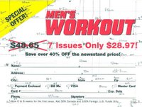
I dissected a subscription for Men’s Workout magazine to familiarise myself with the layout for a variety of components that make up a magazine. I then created the file in Indesign to practise my layout skills.
01 - Levels
At first glance Men’s Workout has a predominantly homoerotic feel to it. The visually orientated pages warrant a fitting nod to the classic ‘porn’ layout complemented by the equally clichéd glossy paper. However, to assess the magazine from the eye of a body builder (their ‘target’ market) the layout is methodical and simple to follow, with a variety of grid systems working throughout the magazine with some pages devoted entirely to pictures. However the historical background for these magazines positively suggests that the actual market for beefcake magazines are homosexuals. The provocative poses of Men’s Workouts models (and even the editor) suggest another level of camaraderie. Due to the conservative and homophobic social culture of the early 20th Century censorship laws made sure that gay pornography could not be sold openly. Thus the beefcake magazine was born. The relationship between imagery and text within Men's Workout has a number of levels of interpretation, there is the literal level that is denotive a rigid layout that is both methodical and practical, the images are also practical yet have a considered aesthetic to enhance the models physique through a number of devices, oil on the mens bodies, the flexing of muscles. There are also an endless number of connotive meanings, these meanings are largely governed by the reader and what they wish to gain from reading the magazine. The readership demographic and nature of the magazine indicates that the stereotypical reader is a man in his mid-thirties and is most probably gay. I think it could be interesting to understand why if the readers are homosexual do they not now buy gay pornography, is it because they enjoy the fact that this is not overtly a gay magazine, perhaps they feel that they would be entering a point of no return by buying a gay magazine when perhaps they are merely just interested in a man's physique a not yet or not by definition homosexual. I think that in current western society there is no definite social acceptance for a man that is intrigued by the same sex, and their physique. A women can quite happily say that another women is attractive and even mention physique in a way that could be similar to a mans response. Men's Workout is quite a poular magazine, I can therefore presume that there are readers who enjoy and buy this niche magazine.
01 - Semierotics

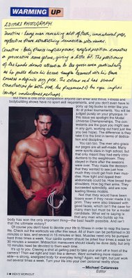
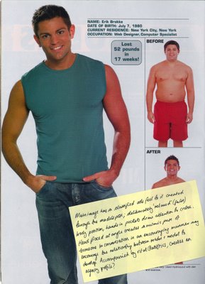
The variety of levels to Men’s Workout has lead me to explore the more subtle messages and connotations. I have begun to deconstruct and analyse both the images and language used throughout Men’s Workout, including the advertisements, I think these actually imply a lot more about the readership than the magazine content itself. I hope that once I can understand more about semiotic theory I can draw a thread that I could twist to create a subtle but hopefully clever twist on the original content. I have read a couple of different books on semiotics, 'Introduction to Communication Studies' was by far the most understandable.
01 - The Heat
Anjuli and Blanka have been poorly so couldn’t come in today, however the tutorial with Ben and Luke was productive. In our typical beginning of the year conforming selves Chris and I were under the impression that we were following the grid to a t. So when Ben suggested that we put Big Brother’s Pete’s head on a body builders body for the front page we soon realised that we could loosen up a bit. The Heat and Men’s Workout collaboration is pretty much there.
01 - Tips Galore
Some indesign tips:
1. To effectively use clipped images from photoshop follow:
- lasso image needed, close lasso.
- (pages window) press circle with triangle
- make work path
- press circle with triangle, save work path, and name
- press circle with triangle, clipping path
save photoshop document as EPS, this should stop problems of the transparencies you gain from using a PNG file.
01 - Readership
The heat and Men’s Workout collaboration has cemented my understanding of both the editorial and design decisions that combine to create Men’s Workout grid systems and layout. The layout for Men’s Workout holds an ironic quality that most magazines play with. The grid system is not at all exact yet the content has specific order, and the differentation from their house typefaces are rare. The attempts to create a dynamic page is somehow made static despite the ‘workout’ content. Given the important fact that Men’s Workout readers are predominantly homosexual, does this in fact mean that they do not care for making there own muscles bigger but are in fact buying it solely for the visual, ‘eye candy’? In this case is the classic Men’s Workout reader in the same situation as homosexuals in th1940’s? Perhaps they are in denial also and rely on buying a magazine with particularly macho male content to both gain imagery they want yet not have to buy gay pornography, is it perhaps the first step for homosexuals, the first experience of buying a magazine for men, with men as the content?
01 - Top Trumps


After much deliberation I specified my research towards the vital statistics within the magazine of the models. It interested me that alot of information on the models was accompanied by the photos and workout routines. This could be an editorial device to encourage a relationship between the models and the readers, so the readers can relate to the models, for example finding out that Cyrus Siminpour is also a computer technician may allow the readers to feel slightly more on the same social scale, despite the fact that one member of the relationship is modelling for a magazine. I also think that these vital stats have a definite similarity to the vital stats you find on dating websites, once I played with this idea for a bit, Top Trumps seemed like a fitting answer. It is prinicpally a game from which you play of each card against another. This rung echoes within the magazine with a number of articles detailing current competitions. After Fridays tutorial Luke suggested researching a number of websites on both Polari and the handkerchief codes, these are codes that first came into existence around the 1960's. I had previously done some research on sociologist, Humphry's who experimented with these codes during a covert experiment in which he entered public toilets wearing a different variety of handkerchiefs and tested the outcomes, of which were unsuprisingly quite interesting... Since doing some research on this I decided to include some words that originated from this language, however I want this to be quite subtle, ideally I would evisage the limited edition of Mens Workout Top Trumps 2006, being a free gift with a copy of Men's Workout, I played with the idea of it being called Men's Workout Little Black Book, as it categorises a number of the men within the field. I wanted the layout to have the practical feel of a top trumps card so included the key aspects of original top trumps yet played with the language so there is potentially a number of hidden meanings.
01- Sexy letters


Here are some images of wooden block compositions that I found at my Aunty's house, some of the typefaces are really unique, I love the tactile feel of glyphs.
01 - Anna Gerber

The graphic designer Anna Gerber has some really lovely philosophies on accidental design within her book All Messed Up that I felt were appropriate for analysing destroying graphics, the destruction of anything will inevitably create something different perhaps even better than the original, I like exploring this unique process of going backwards yet forwards.
01 - Practise makes perfect...

This is one of my first compositions with the wooden letters, I quite like it although I would like for it to be slightly more legible and to contain more headlines to decipher.
01 - Final Image

My final design for the destroy part of the brief I really like the final compostion, I think to really appreciate it's texture and colour tones I would like to print on a large scale perhaps A2.
01 - Contemporary Work

This British Airways Poster was designed for the African market by Bartle Bogle Hegarty, it aims to motivate consumersto use ba.com. I really like the dynamic use of typography, the final visual has a very pleasing aesthetic, a result of a simple concept complemented by a good choice of typeface, colour palette and effect.
First full day of the brief today and it has been quite productive. I asked a number of print shops whether they could print a replica cover and insert pages of Men's Workout, they informed me that regular graphics printers cannot print to a high standard of gloss that is created on the original, the only way that could get gloss was to perhaps try a specialist printers or a snappy snaps.
After our indesign tutorial our group stayed for a couple of hours to discuss different aspects that need to be considered, we then ordered these in terms of priority and delegated different tasks .
After speaking to David Barnet we gained information about which programmes were best to use for different thhings, i.e effects on type can be done on illustrator and then imported to indesign as there are more effects on offer, we have a variety of effects needed on the front page ranginng from drop shadows( we can do in indesign) to embossing. Whether or not to save the entire file as a inbooklet or a pressed quality image, pdf. He gave some advice on the clone stamp in photoshop for our images, he explained that you could within the eyedropper tool there are three different settings a pixel point, or a average point etc, and for our front cover a average point would be the best to use to gain the most even coverage. He also mentioned about the difficulties of gaining the absolute colours when printed because we are going through so many different processes, the real object (LAB), scanning in (RGB), then printing out (CMYK), so without exact pantone references we will have to do test proofs, which is expensive but wll help gain the best colour likeness.
I went and spoke with Geoff in the reprographics centre for his advice on the project and to ask him whether he could print to the standard and on specific paper as we needed. The 'quick' question turned into almost an hour's consultation which was really helpful. He explained alot of the printing processes involoved in creating a magazine like this.
01 - Beefcake

A successful find whilst having a ponder in the erotic section at Waterstones.
01 - Beefcake Vs. Cheesecake
After doing some background research on Men’s Workout magazine I feel like I understand the context of the magazine and why it exists. Men’s Workout falls into the category of ‘beefcake’ magazines, aptly named after the ‘cheesecake’ magazines that originated in the 1920’s, attractive female models posed in magazines such as Playboy. Gradually the interest in men’s muscles soon escalated to justify the first magazine devoted to manly concerns of building strength and muscle, and by the time World War Two finished the male image had an established foothold in the visual medium of magazines.
01 - Mmmmm...

01 - Dissection of Simple Layouts

I dissected a subscription for Men’s Workout magazine to familiarise myself with the layout for a variety of components that make up a magazine. I then created the file in Indesign to practise my layout skills.
01 - Levels
At first glance Men’s Workout has a predominantly homoerotic feel to it. The visually orientated pages warrant a fitting nod to the classic ‘porn’ layout complemented by the equally clichéd glossy paper. However, to assess the magazine from the eye of a body builder (their ‘target’ market) the layout is methodical and simple to follow, with a variety of grid systems working throughout the magazine with some pages devoted entirely to pictures. However the historical background for these magazines positively suggests that the actual market for beefcake magazines are homosexuals. The provocative poses of Men’s Workouts models (and even the editor) suggest another level of camaraderie. Due to the conservative and homophobic social culture of the early 20th Century censorship laws made sure that gay pornography could not be sold openly. Thus the beefcake magazine was born. The relationship between imagery and text within Men's Workout has a number of levels of interpretation, there is the literal level that is denotive a rigid layout that is both methodical and practical, the images are also practical yet have a considered aesthetic to enhance the models physique through a number of devices, oil on the mens bodies, the flexing of muscles. There are also an endless number of connotive meanings, these meanings are largely governed by the reader and what they wish to gain from reading the magazine. The readership demographic and nature of the magazine indicates that the stereotypical reader is a man in his mid-thirties and is most probably gay. I think it could be interesting to understand why if the readers are homosexual do they not now buy gay pornography, is it because they enjoy the fact that this is not overtly a gay magazine, perhaps they feel that they would be entering a point of no return by buying a gay magazine when perhaps they are merely just interested in a man's physique a not yet or not by definition homosexual. I think that in current western society there is no definite social acceptance for a man that is intrigued by the same sex, and their physique. A women can quite happily say that another women is attractive and even mention physique in a way that could be similar to a mans response. Men's Workout is quite a poular magazine, I can therefore presume that there are readers who enjoy and buy this niche magazine.
01 - Semierotics


The variety of levels to Men’s Workout has lead me to explore the more subtle messages and connotations. I have begun to deconstruct and analyse both the images and language used throughout Men’s Workout, including the advertisements, I think these actually imply a lot more about the readership than the magazine content itself. I hope that once I can understand more about semiotic theory I can draw a thread that I could twist to create a subtle but hopefully clever twist on the original content. I have read a couple of different books on semiotics, 'Introduction to Communication Studies' was by far the most understandable.
01 - The Heat
Anjuli and Blanka have been poorly so couldn’t come in today, however the tutorial with Ben and Luke was productive. In our typical beginning of the year conforming selves Chris and I were under the impression that we were following the grid to a t. So when Ben suggested that we put Big Brother’s Pete’s head on a body builders body for the front page we soon realised that we could loosen up a bit. The Heat and Men’s Workout collaboration is pretty much there.
01 - Tips Galore
Some indesign tips:
1. To effectively use clipped images from photoshop follow:
- lasso image needed, close lasso.
- (pages window) press circle with triangle
- make work path
- press circle with triangle, save work path, and name
- press circle with triangle, clipping path
save photoshop document as EPS, this should stop problems of the transparencies you gain from using a PNG file.
01 - Readership
The heat and Men’s Workout collaboration has cemented my understanding of both the editorial and design decisions that combine to create Men’s Workout grid systems and layout. The layout for Men’s Workout holds an ironic quality that most magazines play with. The grid system is not at all exact yet the content has specific order, and the differentation from their house typefaces are rare. The attempts to create a dynamic page is somehow made static despite the ‘workout’ content. Given the important fact that Men’s Workout readers are predominantly homosexual, does this in fact mean that they do not care for making there own muscles bigger but are in fact buying it solely for the visual, ‘eye candy’? In this case is the classic Men’s Workout reader in the same situation as homosexuals in th1940’s? Perhaps they are in denial also and rely on buying a magazine with particularly macho male content to both gain imagery they want yet not have to buy gay pornography, is it perhaps the first step for homosexuals, the first experience of buying a magazine for men, with men as the content?
01 - Top Trumps


After much deliberation I specified my research towards the vital statistics within the magazine of the models. It interested me that alot of information on the models was accompanied by the photos and workout routines. This could be an editorial device to encourage a relationship between the models and the readers, so the readers can relate to the models, for example finding out that Cyrus Siminpour is also a computer technician may allow the readers to feel slightly more on the same social scale, despite the fact that one member of the relationship is modelling for a magazine. I also think that these vital stats have a definite similarity to the vital stats you find on dating websites, once I played with this idea for a bit, Top Trumps seemed like a fitting answer. It is prinicpally a game from which you play of each card against another. This rung echoes within the magazine with a number of articles detailing current competitions. After Fridays tutorial Luke suggested researching a number of websites on both Polari and the handkerchief codes, these are codes that first came into existence around the 1960's. I had previously done some research on sociologist, Humphry's who experimented with these codes during a covert experiment in which he entered public toilets wearing a different variety of handkerchiefs and tested the outcomes, of which were unsuprisingly quite interesting... Since doing some research on this I decided to include some words that originated from this language, however I want this to be quite subtle, ideally I would evisage the limited edition of Mens Workout Top Trumps 2006, being a free gift with a copy of Men's Workout, I played with the idea of it being called Men's Workout Little Black Book, as it categorises a number of the men within the field. I wanted the layout to have the practical feel of a top trumps card so included the key aspects of original top trumps yet played with the language so there is potentially a number of hidden meanings.
01- Sexy letters


Here are some images of wooden block compositions that I found at my Aunty's house, some of the typefaces are really unique, I love the tactile feel of glyphs.
01 - Anna Gerber

The graphic designer Anna Gerber has some really lovely philosophies on accidental design within her book All Messed Up that I felt were appropriate for analysing destroying graphics, the destruction of anything will inevitably create something different perhaps even better than the original, I like exploring this unique process of going backwards yet forwards.
01 - Practise makes perfect...

This is one of my first compositions with the wooden letters, I quite like it although I would like for it to be slightly more legible and to contain more headlines to decipher.
01 - Final Image

My final design for the destroy part of the brief I really like the final compostion, I think to really appreciate it's texture and colour tones I would like to print on a large scale perhaps A2.
01 - Contemporary Work

This British Airways Poster was designed for the African market by Bartle Bogle Hegarty, it aims to motivate consumersto use ba.com. I really like the dynamic use of typography, the final visual has a very pleasing aesthetic, a result of a simple concept complemented by a good choice of typeface, colour palette and effect.